 Your company's corporate identity should reflect your company's values and should strike an emotional chord in your customers' mind. Shombit Sengupta, the founder of Shining Emotional Surplus, tells us how he created Wipro's new 'Rainbow Flower' logo using the 'Emotional Surplus' strategy.
An identity is a seal of recognition. It has the power to make people understand, identify and recognise the value or message of any physical substance or personality. It has even helped capture an entire human civilization in a holistic manner -- pyramids today are synonymous with ancient Egypt.
A corporation's ability to connect with its stakeholders will always come from its visible identity -- its corporate identity or the identity of its products or services. And a consumer's desire to experience a branded product starts from the identity of that product.
Organisations very often do not understand the difference between a business identity and a graphic logo. If a designer does not have business orientation he or she will deliver a charming graphic logo. But corporations must not accept that, because identities are much more powerful than mere graphic designs.
When your identity communicates your organisation's core beliefs and values with energy, it inspires people.
For customers to develop attachment to your brand, your identity must have a strong character that symbolically expresses the core values of your proposition to your customer. The identity of any business has to have a strong rational and functional support that serves the deeper needs of the customer. Having that as a skeleton, you can elevate your proposition to the subconscious mind of your customer.
The rational and functional base, with an emotional content, connects with people beyond their expectation where the competition cannot enter -- creating emotional surplus. This, for example, was the thinking behind Wipro's corporate repositioning in 1998 with the 'Rainbow Flower' identity.
Flower power
 Semantically, the name Wipro does not mean anything. When we started work for Wipro in 1996 we found that every division was a different company in spirit and there was no linking concept that bonded the divisions, no branding coherency across businesses. Each division had its own separate mission, and neither Wipro as a corporation nor its identity was aspirational.
Our interactions with different Wipro stakeholders such as employees, the distribution channel, shareholders and customers allowed us to flesh out Wipro's hidden values, as well as any mismatch between corporate and customer need.
It revealed a clear picture of the different competitors, and formed the foundation for our interaction with customers. Wipro had communicated a lot of things over the years, but in the competitive scenario, what had the end-user picked up? We tried to extract this.
Our research revealed that Wipro has diligent, hardworking and sincere employees. But end-users felt Wipro had unfocussed multifaceted businesses. Wipro was seen as very cold and process-oriented, yet Wipro delivered on its commitment.
We found the corporation could take a platform of the value of essential to intelligent, from consumer products up to technology. It was important to provide an identity that linked all of Wipro's diversified businesses.
We identified four values that would provide critical benefits to end users -- human values, integrity, innovative solutions and value for money. Having done that we created the core concept of 'Applying Thought' (Wipro is process oriented + thinks for you) that signifies being ahead of time.
This was the strategic leap for Wipro. The four values would converge on Wipro's corporate promise of 'Applying Thought'. And information technology would lead the corporation as an engine, while all the other businesses would be the wagons of the locomotive.
The brightness of the 'Rainbow Flower' would manifest the corporation's value of integrity, while the rainbow's fresh appearance after the storm would reflect human values.
Everyone can relate to the rainbow because it's in nature. It's rare, but when it appears everyone can see it. This simplicity and rareness would comprise value for money. The central part of the flower denoting digital complexity would reflect the value of innovative solutions.
Customer interactions through research confirmed that Wipro's identity made the corporation into a young, vibrant diversified group with a single personality.
Customers said 'Applying Thought' means that Wipro thinks for the customer's well being, is strong in R&D and thinks out-of-the-box. The flower symbolises that Wipro cares for the environment, its center shows the digital age, science and technology, its petals reflect the softness of human values.
The 'Rainbow Flower' looks feminine, 'Applying Thought' feels masculine, and Wipro in the center complements both with the colours of life. Wipro has now become an aspirational brand.

The first time people see an identity they must be provoked by it so that an interest develops. For example, towards the end of the seventies when IBM was internationally established and reputed as a gigantic IT company, Apple Computers suddenly came in with a provoking product with a relevant identity -- an apple.
People could have said at that time that it's irrelevant to connect a computer and an apple. But the apple was already associated with the genius of Newton's theory of gravitation. In Biblical expression, the apple comprised the symbol of Eve being provoked by it to indulge in pleasure.
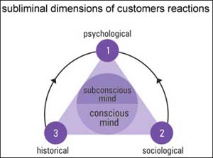
Somehow this kind of semiotic brand appeal intrigues and creates curiosity and relevance in the customer's subconscious mind.
IBM at that time used to talk literally, as a sum of all the technical greatness of its computer system. But Apple took the route of invention through the emotional path of history.
When the understanding of an identity is very prosaic, its charm is lost. It then becomes mundane, like a monotonous chore of a conjugal relationship on the rocks.
Art works? A rational and functional foundation
But, here's a word of caution for organisations seeking to make their brands more aspirational through a change of identity. In the current competitive scenario, if you want to create emotional surplus, you must strengthen the rational surplus and functional surplus of the product or service.
Only then will customers see in it a value beyond their expectation that will reach the subliminal territory of 'Emotional Surplus'.
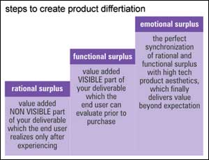
Rational surplus is the value-added non-visible part of your deliverable, such as being defect free, which leads to its good reputation. The customer realises the brand's rational surplus only after experiencing it.
As rational surplus is not visible, it is up to the manufacturer to prioritise and deliver the customers' understanding of the value of rational surplus in the product.

For example, in a car, the customer cannot see the internal performance of the engine. It is non-visible. In a food product, the exact quality of the ingredient is not visible. The customer will always depend on the manufacturer's promise of delivering rational surplus. Over time, brands get trusted and create pride of ownership.
Functional surplus is the value-added visible part of your deliverable that the customer can evaluate prior to purchase. In a car, the external function -- like easy driving, quick pick-up and comfortable seating -- can be tested during purchase and is 'visible.' Similarly a food product can be tasted to discover functional surplus. It cannot be an over promise, be sub optimal, or be fake.
Emotional Surplus: This is the perfect synchronisation of rational and functional surplus, with subliminal aesthetics of the product, which builds organisational coherency and delivers value beyond the customer's expectation.
For example, in the car the styling and ergonomics can increase emotional attachment. In a food product, the product aesthetics itself and its concept and packaging can have emotional content.
In the platform of 'Emotional Surplus', the rational and functional surplus must necessarily provide the strong foundation. The stronger you build the rational and functional surplus, the more your brand will deliver in emotional content, encouraging purchase and repurchase, year after year.
This makes the concept of 'Emotional Surplus' into a business proposition that grows a brand profitably and sustainably.
Only aesthetics and no functional purpose will not deliver emotional surplus -- just like the Thinker of Rodin, a famous sculpture in Paris whose appeal is limited to art lovers. The Eiffel Tower, on the other hand, created in the same time period, has the rational, functional and emotional content woven into it that people can experience.
The rational, functional and emotional steps together create a desire of unending satisfaction -- making tourists return to the Eiffel Tower again and again. And this is the content of 'Emotional Surplus'. Art can bring the philosophy of the past and project futuristic vision; but a utility item has to have rational, functional and 'Emotional Surplus' in the present instance because of its cyclic usage.
Shombit Sengupta is Founder, Shining Emotional Surplus. Renee Jhala is Managing Director, Shining Emotional Surplus.
Published with the kind permission of The Smart Manager, India's first world class management magazine, available bi-monthly.


