 In keeping with the Trusts’ objectives, the initiative was underpinned by an attempt to determine how over-nutrition was impacting citizens at a mass scale.
There’s a new dashboard in town. And this one demonstrates a detailed view of crop production, food consumption patterns, fortification simulation, health outcomes and even nutrient intake.
Backed by the Tata Trusts, this dashboard aggregates agricultural and nutritional data from the National Sample Survey Office, the Indian Council of Agriculture, and the National Family Health Survey.
The dashboard -- an outcome of conversations between members of the National Institute of Nutrition, Hyderabad, St Johns Research Institute, and the Tata Trusts -- kicked off in 2017 with the call to set up a Tata-NIN Centre for Excellence in Nutrition, on the NIN campus in Hyderabad, said Laxman S, advisor to the Trusts.
Since 2013, when Ratan Tata started to pay undivided attention to the Trusts, one of the key causes he encouraged the charities to pursue as a cause for India was nutrition.
The overarching objective of the collaboration between the two is to drive value for the development sector by leveraging big data into outlets such as the dashboard.
The centre, which is driven by 10 advisors, gets technical support from St John’s Medical College in Bengaluru, where researchers and assistants are brought in as and when needed, and the Trusts are committed to supporting the programme for five years, Laxman said.
So mountains of data by itself may not offer many clues, but what does the website tell users beyond statistics such as who has the highest wheat production? Plenty.
For example, according to Tata-NIN's dashboard, almost half of all women in India are anaemic with the worst-performing districts being Gurgaon, Dadra and Nagar Haveli, Sundargarh and the best ones being Champhai, Aizawl and Kohima.
Where is food being produced in the country, does this country eat, and can its consequences in terms of disease be understood are key questions the initiative set out to answer, said Anura Kurpad, head of the department of physiology at St John’s Medical College and an advisor to the Trusts.
“We had to create a nutrition value chain that looked at data of consumption of foods, breaking them down into nutrients and looking at diseases that are associated, and the problem was there was no single data set available to support that.”
The NSSO, which conducts surveys to see what is bought at a district level and data from the NFHS which looks at outcomes was linked to come together on the Trusts’ website.
Govindraj Ethiraj, founder of public data website IndiaSpend.com, said the Trusts’ dashboard “is a welcome and useful start to getting insights, and would become even more valuable once there is the ability to overlay it with even multiple data sets that include, rainfall patterns, per capita affordability, census, and health and population”.
Elements such as rainfall are on the drawing board for addition in the near future.
In keeping with the Trusts’ objectives, the initiative was underpinned by an attempt to determine how over-nutrition was impacting citizens at a mass scale. Kurpad pointed to “fortification”, the chemical introduction of vitamins and minerals to food groups such as lentils, rice and others, could go higher than the daily prescribed value, and that’s where there was widespread concern.
The broader benefits of the dashboard extend to academicians, the medical and pharmaceutical industry.
The risk of exceeding intake of iron, for example, could trigger dietary ailments and upset intestinal bacteria in infants, he said, adding the dashboard could throw more light on such trends at the district level.
The broader benefits of the dashboard extend to academicians, the medical and pharmaceutical industry as well as food companies that may want keener insights into how and when food is being consumed across the country. Kurpad clarified that the data generated by the effort was free to the public and not designed for profit.
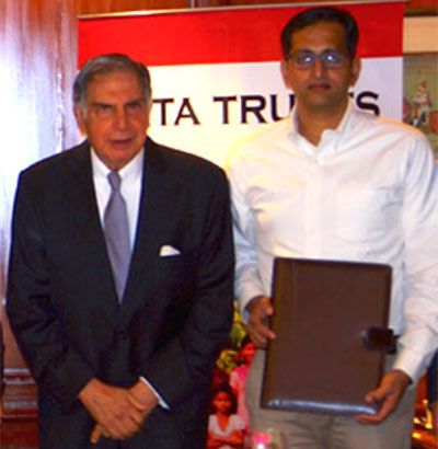
Image: Ratan Tata with R Venkataramanan. Photograph, kind courtesy: Tata Trusts.org.


